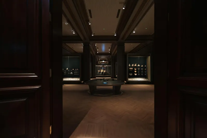
The Theatre of First Impressions
Every morning, millions of us walk past Britain's shop fronts without consciously registering the sophisticated visual choreography at play. Yet these commercial facades represent some of our most refined examples of applied design psychology — spaces engineered to capture attention, communicate character, and compel action within seconds.
While homeowners agonise over front door colours and window boxes, the real masters of kerb appeal are hiding in plain sight on every British high street. From the hand-lettered elegance of century-old chemists to the Instagram-ready geometry of contemporary coffee shops, these commercial frontages offer a masterclass in making powerful first impressions.
Reading the Street Like a Set Designer
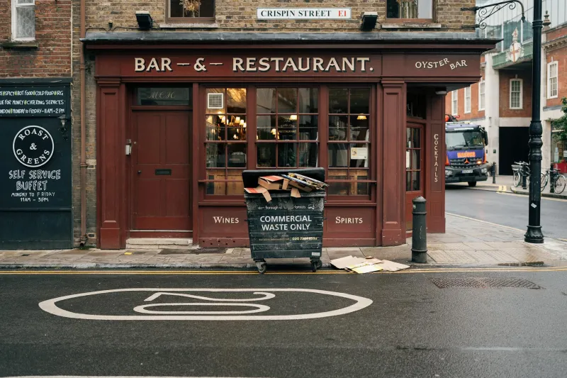
Take a walk down any thriving British high street and you'll notice the most successful shops share certain visual DNA. They understand scale, proportion, and the crucial relationship between signage and architecture. A traditional butcher's shop in Ludlow might seem worlds apart from a sleek gallery in Shoreditch, but both deploy the same fundamental principles of facade composition.
"The best shop fronts work like stage sets," explains facade restoration specialist Emma Hartwell, who has spent two decades reviving heritage commercial properties across the Cotswolds. "They create a frame for the story happening inside, but they also need to project that narrative outward to the street."
This theatrical thinking translates beautifully to domestic architecture. Your front elevation isn't just about protecting the interior from weather — it's your home's opening scene, the visual statement that sets expectations before anyone crosses the threshold.
The Power of Bold Decisions
One of the most striking lessons from Britain's best shop fronts is their confidence with colour and contrast. While residential design often defaults to safe neutrals, successful commercial facades embrace drama. Think of the deep forest green of a traditional pharmacy, the warm terracotta of an independent bakery, or the crisp navy and gold of a heritage tailor.
These aren't arbitrary choices. Each colour decision serves a specific purpose: creating visibility from distance, establishing brand personality, or complementing the architectural period. The same strategic thinking can transform a suburban semi or Victorian terrace.
Consider the iconic red frontages of traditional post offices, or the distinctive blue-green of Farrow & Ball's showrooms. These aren't just paint colours — they're carefully calibrated tools for creating instant recognition and emotional connection.
Typography as Architecture
Perhaps nowhere is the sophistication of shop front design more evident than in the treatment of signage and lettering. The best examples integrate typography as a fundamental architectural element, not an afterthought bolted onto the building.
Look at the carved stone lettering on an Edwardian department store, where the scale and positioning of each character creates rhythm across the entire facade. Or examine how contemporary independent retailers use oversized numerals and minimal typefaces to create striking focal points.
For homeowners, this suggests thinking beyond the standard house number plaque. Consider how the scale, positioning, and style of your address signage contributes to your property's overall visual impact. A bold, well-proportioned house number can anchor your entire front elevation.
Material Conversations
The most compelling shop fronts create dialogue between different materials and textures. A Victorian ironmonger might combine painted timber, etched glass, and polished brass into a composition that feels both rich and coherent. Modern boutiques often play sleek metals against warm woods, or contrast rough textures with smooth surfaces.
This principle of material layering offers valuable lessons for residential design. Instead of treating your front door as an isolated element, consider how it relates to surrounding materials — the texture of your external walls, the finish of your window frames, the character of your garden boundary.
The Art of Illumination
After dark, the best shop fronts transform entirely through carefully considered lighting. It's not just about visibility — it's about creating atmosphere and extending the building's presence into the street. Traditional shopkeepers understood this instinctively, using warm gas lamps to create pools of welcoming light.
Contemporary examples often use architectural lighting to emphasise key features or create dramatic silhouettes. For homes, this suggests moving beyond functional porch lights to think about how evening illumination can enhance your property's architectural character.
Lessons in Layered Storytelling
The most successful British shop fronts tell layered stories through their design choices. They might reference their building's architectural heritage while signalling contemporary relevance. They balance commercial necessity with aesthetic ambition. They create spaces that feel both professional and personal.
These same qualities — historical awareness, contemporary confidence, and personal expression — define the most compelling residential facades. Whether you're updating a Georgian townhouse or designing a contemporary extension, the visual language of Britain's best shop fronts offers a rich vocabulary for creating homes with genuine street presence.
The next time you're walking through Marylebone or exploring a market town in the Yorkshire Dales, pause to really examine the commercial facades around you. Behind their apparent simplicity lies decades of accumulated wisdom about colour, proportion, materials, and the subtle art of visual persuasion — lessons that could transform how your own home presents itself to the world.