Walk onto any British film set or theatre stage, and you'll witness something extraordinary. Every wall, every fabric, every painted surface has been chosen not for its aesthetic appeal, but for its ability to make you feel something specific. Set designers are the unsung masters of colour psychology, wielding hues like conductors directing an orchestra of emotions.
The Science Behind Scene-Setting
Whilst interior designers often follow established palettes and trending colours, set designers work backwards from emotion. Sarah Mitchell, production designer for several BBC period dramas, explains her approach: "I start with the character's emotional journey, then build the colour story around that. A room needs to feel anxious, comforting, oppressive, or liberating before it needs to look pretty."
This fundamental difference in approach explains why some rooms photograph beautifully but feel emotionally flat when you're actually in them. Set designers understand that colour temperature, saturation, and contrast work together to create psychological responses that bypass conscious thought entirely.
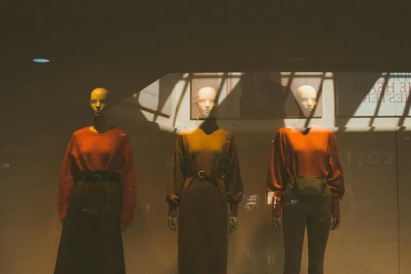
Consider the warm, honey-toned interiors of Downton Abbey versus the stark, desaturated palette of Black Mirror. Each colour choice serves the narrative, guiding viewers' emotional responses before a single word of dialogue is spoken.
Beyond the Colour Wheel: Layered Storytelling Through Hue
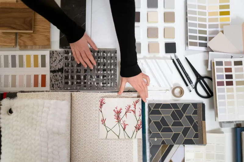
Traditional interior design often relies on harmonious colour schemes, but set designers embrace discord when it serves the story. Tom Phillips, who designed sets for several West End productions, advocates for what he calls "emotional layering": "You might have a predominantly warm room, but introduce cool undertones through metallics or textiles to create subtle unease. It's about creating complexity that mirrors human emotion."
This technique translates beautifully to residential spaces. A sitting room might feel more dynamic with warm walls offset by cooler accent pieces, creating visual tension that keeps the space engaging rather than static. The key is intentionality – every colour choice should serve a purpose beyond mere coordination.
The Power of Contrast: Creating Visual Drama at Home
Set designers excel at using contrast to direct attention and create hierarchy within a space. They understand that the human eye is drawn to areas of highest contrast, a principle that can transform how we navigate and experience our homes.
James Robertson, production designer for several Channel 4 dramas, shares a practical insight: "We use what I call 'anchor points' – areas of high contrast that ground the viewer in the space. In a home, this might be a dark feature wall behind a light sofa, or vibrant artwork against neutral walls. It's about creating focal points that feel deliberate, not accidental."
This approach challenges the conventional wisdom of matchy-matchy interiors. Instead of seeking perfect harmony, consider where strategic contrast might add visual interest and emotional depth to your spaces.
Colour Temperature as Mood Control
One of the most sophisticated tools in a set designer's arsenal is the manipulation of colour temperature – the warmth or coolness of colours – to influence mood and perception of time and space.
Cool blues and greys can make spaces feel larger but more distant, whilst warm yellows and reds create intimacy but can make rooms feel smaller. Set designers layer these temperatures strategically, often within the same colour family, to create nuanced emotional responses.
For homeowners, this might mean choosing warm whites for cosy bedrooms but cool whites for energising workspaces, or incorporating both warm and cool greys in a single room to create depth and visual interest.
Practical Applications: Bringing Set Design Home
The Breakfast Scene Technique
Set designers often create what they call "transition colours" – hues that help move characters (and audiences) emotionally from one scene to another. In your home, transition colours can help move you psychologically from work mode to relaxation mode. Consider how the colours in your hallway might prepare you for the different emotional needs of each room.
The Supporting Actor Approach
Not every colour needs to be a star. Set designers use "supporting" colours that enhance the main palette without competing for attention. In residential design, this might mean choosing accent colours that amplify your primary hue rather than contrasting with it.
The Seasonal Arc Method
Many productions use subtle colour shifts to reflect character development or seasonal changes. Your home can employ similar techniques through easily changeable elements like cushions, throws, and artwork that shift the emotional tone of rooms throughout the year.
The British Context: Working with Natural Light
UK homes present unique challenges that set designers understand well. Our famously variable light conditions mean colours can appear dramatically different throughout the day. Professional designers test their palettes under different lighting conditions, understanding that a colour that feels vibrant under artificial light might appear muddy in grey British daylight.
Mitchell recommends the "four o'clock test": "Look at your colour choices at four in the afternoon on a cloudy day – that's when most British interiors are at their most challenging. If your colours still feel intentional and emotionally resonant then, they'll work year-round."
Moving Beyond Decoration to Transformation
The most significant lesson from set designers is that colour should never be an afterthought. It's not decoration applied to a finished space – it's the foundation of how that space makes you feel.
Next time you're considering a colour change, ask yourself not "What looks nice?" but "How do I want to feel in this room?" Then work backwards, like a set designer creating a scene, choosing colours that serve that emotional goal.
This shift in thinking – from colour as decoration to colour as emotional architecture – is what separates spaces that merely look good from those that truly transform how we live.